Cashrewards’ email production relied on manual, design-intensive processes. Each campaign was built from scratch, making it time-consuming to scale, difficult to personalise and prone to inconsistencies across touchpoints.
With the introduction of Braze, a new CRM platform built for automation and dynamic content, the limitations of the existing workflow became more apparent. To align with this shift and unlock Braze’s capabilities, I led the design of a modular email system, consisting of a reusable component framework that streamlined production, supported personalisation at scale and ensured a consistent, responsive user experience across email clients.
Focus
Email Automation
Duration
December 2023 - April 2024
Goals & Objectives
Business Objectives
✅ Improve operational efficiency by reducing the manual effort required for email production.
📩 Enable the CRM and Marketing teams to deliver timely, personalised communications via Braze.
🎨 Maintain brand consistency and design quality across all email communications to build user trust and recognition.
Design Goals
🧩 Create a modular, flexible component system to reduce reliance on custom designs and development.
📱 Design for responsive, mobile-first layouts to ensure accessibility, usability, and visual consistency across all devices, including dark mode support.
⚡ Optimise load performance by using lightweight assets and scalable HTML structures.
HMW
How might we streamline email production to support scalable, personalised communications at Cashrewards?
Research & Insights
Before Braze was introduced, I had initiated an earlier email redesign project to address known inefficiencies in the campaign production process. Although that work was paused due to shifting priorities, the rollout of Braze presented an opportunity to revisit these challenges with the added goal of supporting automation and personalisation at scale.
I mapped the end-to-end lifecycle of email production, from campaign briefing through to deployment, to understand where the process was breaking down. This included working across Design, CRM, Marketing, and Sales to gather qualitative insights. A consistent theme emerged: change requests often triggered a full reset of the design and approval process, leading to repeated handovers, missed deadlines, and reduced delivery speed.
My audit revealed that while each email followed brand guidelines, the visual execution lacked consistency. Because every campaign was custom-built, layouts varied significantly and created a fragmented user experience. Many emails struggled with hierarchy, with competing offers and dense messaging often overwhelming the reader. Without a unified structure, it became difficult to scale production and maintain consistent quality across campaigns.

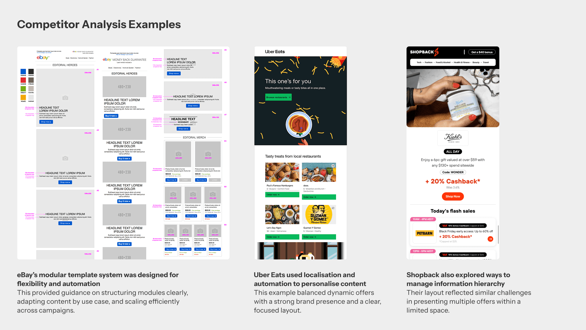
To inform our email design direction, I conducted a competitor analysis, focusing on brands that successfully balanced brand identity with modular, scalable frameworks. eBay emerged as a strong reference - its modular system mirrored the marketplace model of Cashrewards and enabled dynamic content delivery through interchangeable blocks. I also studied examples from Uber and ShopBack, who demonstrated strong brand continuity while maintaining clarity and content hierarchy.
Collaborating with the CRM team also helped clarify Braze’s technical constraints, allowing me to define a system that was both visually consistent and operationally efficient. A few performance-focused insights included:
Single-column layouts proved most scalable and mobile-responsive, which is essential for a mobile-first experience and a quicker build.
Web fonts, while visually aligned with brand guidelines, added load time across email clients. Therefore, switching to system fonts provided performance benefits but required brand compromise.
Legacy compatibility required table-based HTML layouts to accommodate clients like Outlook, which imposed design constraints around height, spacing and module shapes.
Dark mode introduced accessibility challenges, requiring careful contrast testing and adjustments to meet WCAG standards and maintain legibility in both light and dark environments.
These insights laid the groundwork for a modular system optimised not only for visual cohesion and brand trust, but also for performance, accessibility, and ease of use.
Discovery & Ideation
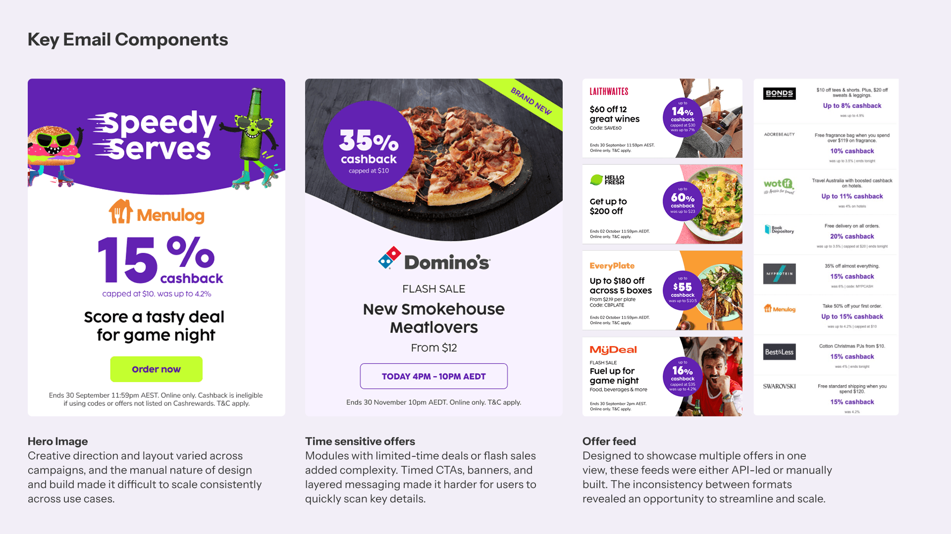
I began by auditing the existing email suite to identify design inconsistencies, layout patterns and production pain points. From there, I collaborated with the CRM team to identify the most commonly used modules and campaign types, which could be separated into 3 key categories:
Hero creatives (e.g. trending offers, seasonal campaigns)
Time-sensitive callouts (e.g. flash sales, bonus offers)
Feed-based modules, displaying multiple offers either dynamically populated or manually curated.
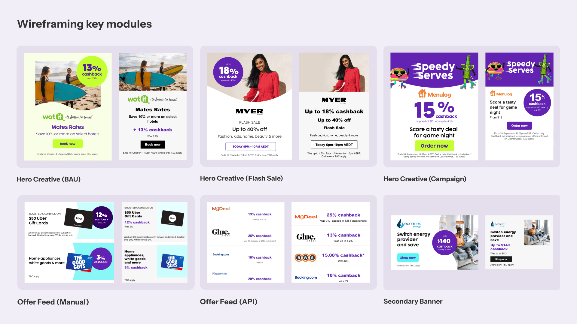
Wireframes & Prototyping
Working in wireframes, we stripped the email system back to its core, reducing each module to its most essential layout elements. This included testing combinations of typography (using Arial, our system fallback font), CTA placement and image layout within the constraints of table-based HTML, to ensure compatibility with legacy clients like Outlook. During this exploration, we also identified the need for additional layout variants, such as secondary CTAs and alternative text-image combinations, to improve flexibility ahead of final design.
Several design challenges surfaced during this stage. One key issue was the lack of standardised merchant logo sizing, which could lead to misalignment across campaigns. We introduced bounding boxes to enforce a consistent scale while preserving legibility and accommodating different logo formats within Braze’s automation.
Information hierarchy also required attention. Some campaigns could emphasise cashback, while others prioritised the merchant or the offer. We prototyped and introduced flexible content variants to support these different structures.
To ensure key content remained above the fold while maintaining legibility across screen sizes, we ran height testing on multiple mobile devices. We also tested character count limits and defined layout breakpoints and fallback behaviours to manage content overflow and maintain consistency.
These foundations supported a responsive, adaptable system that could scale and evolve further as we moved into refinement.

Design Refinement
With the core layouts established, I began reintroducing brand elements into the system, including colour, the curve element featured in hero imagery, and the signature cashback badge. While these helped reinforce brand identity, they also introduced technical challenges. The badge was difficult to implement consistently within table-based HTML, and the curve added build complexity within modules.
I stress-tested the modules using real campaign content and reviewed them in regular feedback sessions with the CRM team and developers. Based on those conversations, the badge was removed to allow cashback amounts to be automated and remain clearly legible across layouts. I chose to relocate the curve to the footer as a more consistent and lightweight way to preserve brand identity without affecting layout flexibility.
I also explored background tints to make content feel more dynamic and visually engaging. However, they introduced accessibility concerns and added complexity when supporting both light and dark modes. Removing the tints helped maintain readability, and placing the curve in the footer became the clearest way to retain a subtle brand presence across all variants.
For time-sensitive campaigns like flash sales, I created animated tickers using lightweight GIFs placed at the top of emails to draw attention without disrupting content hierarchy. These were a few key refinements that made the system more cohesive, accessible, and ready for high-fidelity design.

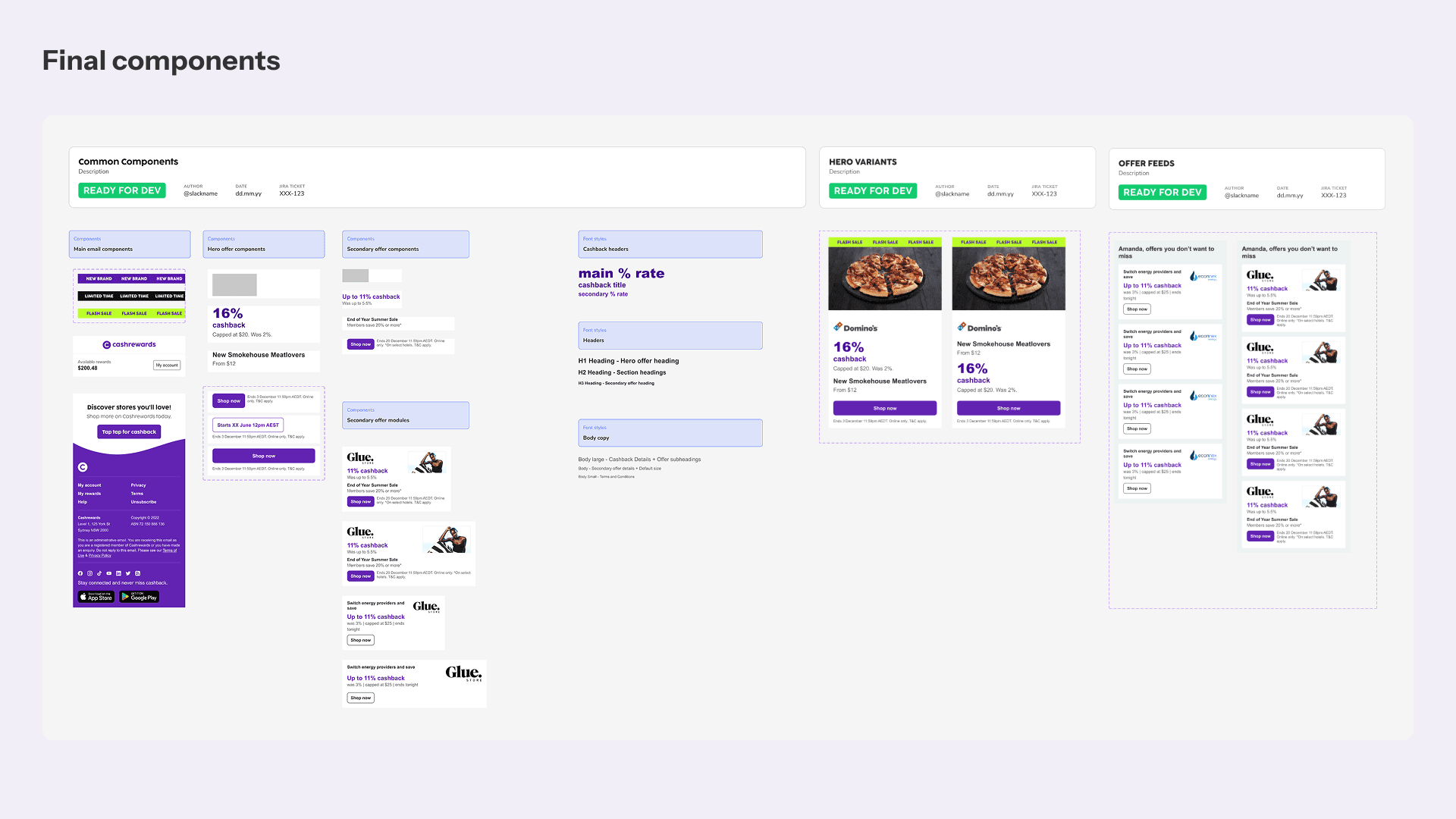
High-Fidelity Design & Final Solution
With the system aligned across content, brand, and technical requirements, I moved into finalising the visual design. This phase focused on polishing spacing, typography, and visual hierarchy across use cases and breakpoints.
Accessibility was a key consideration, particularly in exploring dark mode. I conducted colour contrast checks to meet WCAG standards and made further refinements to ensure legibility across themes. This was especially important in modules using the footer curve and layered content.
Templates were tested in Litmus across major email clients to validate structure and responsiveness. Real device previews were used to check breakpoints, stack behaviour, and layout stability across mobile, tablet and desktop.
To ensure the system could support personalisation, dynamic content tests were run in Braze using live offer data, merchant logos, and varied content formats. I reviewed the outcomes to ensure the layouts remained visually consistent across segments and automation flows.
Once the designs were finalised, I handed off the annotated system for implementation. The final solution enabled the CRM and Marketing teams to scale campaigns efficiently while maintaining a cohesive and accessible user experience.

Learnings
🤝 Designing for legacy constraints requires creative restraint.
Working with email highlighted just how limited the medium is, especially when designing for older clients like Outlook. While there’s so much potential to push visual design in email, creating a consistent experience meant I had to be mindful of technical limitations. Collaborating closely with developers and the CRM team helped me ground design decisions in what was realistic to build, test, and scale.
🧠 Balancing brand identity within a scalable system is tough.
Designing a modular system for email meant constantly navigating the trade-off between consistency and character. Too much standardisation risked stripping away brand personality, while too much customisation could break the system. Throughout the process, I aimed to preserve recognisable elements of the Cashrewards brand, while still building a scalable, automation-friendly framework. Maintaining brand presence was never an afterthought; it was a key consideration throughout the design process.
💡 A scalable system isn’t useful if it can’t adapt.
It wasn’t enough to create a neat set of reusable modules, the system had to flex to meet the changing needs of both the business and its users. Throughout the design process, I stress-tested the framework against worst-case content scenarios, edge cases, and sought feedback to ensure it could handle real-world demands. This helped shape a system that wasn’t just scalable, but practical and resilient.
📱 Designing mobile-first clarified what mattered most.
Approaching the system from a mobile-first perspective helped ensure that key messaging and CTAs weren’t treated as afterthoughts. Working within a constrained space required more strategic decisions around hierarchy, layout, and usability. It helped distill the experience down to what users needed most, without distraction.
Opportunities for Future Improvement
Expand the modular system across lifecycle and operational touchpoints.
While the system currently supports marketing and CRM-led campaigns, there is an opportunity to scale it further across system emails, lifecycle journeys, and milestone-based communications. Extending this consistency would help reinforce brand trust, improve maintainability, and create a more unified experience across the platform.Deepen dark mode optimisation through a dedicated second phase.
Initial improvements brought dark mode support in line with accessibility standards, but there is still work to be done to address edge cases, theme variations, and broader layout adaptability. A dedicated second phase would allow for more refined testing, greater visual polish, and a stronger user experience across all modes.
Final Thoughts
Introducing a modular design system enabled Cashrewards to deliver more personalised, timely, and consistent email campaigns at scale. By streamlining production and aligning design with cross-functional workflows, we reduced manual effort while supporting dynamic, data-driven content.
This shift made it easier to segment users, tailor messaging to intent, and activate more relevant offers, helping build user trust and improve campaign performance. Early indicators show increases in MIU, MAU, and GMV across early lifecycle moments, particularly between a user’s first and third shop. The system also unlocked the ability to move faster with Braze, setting the groundwork for further automation and targeting.